
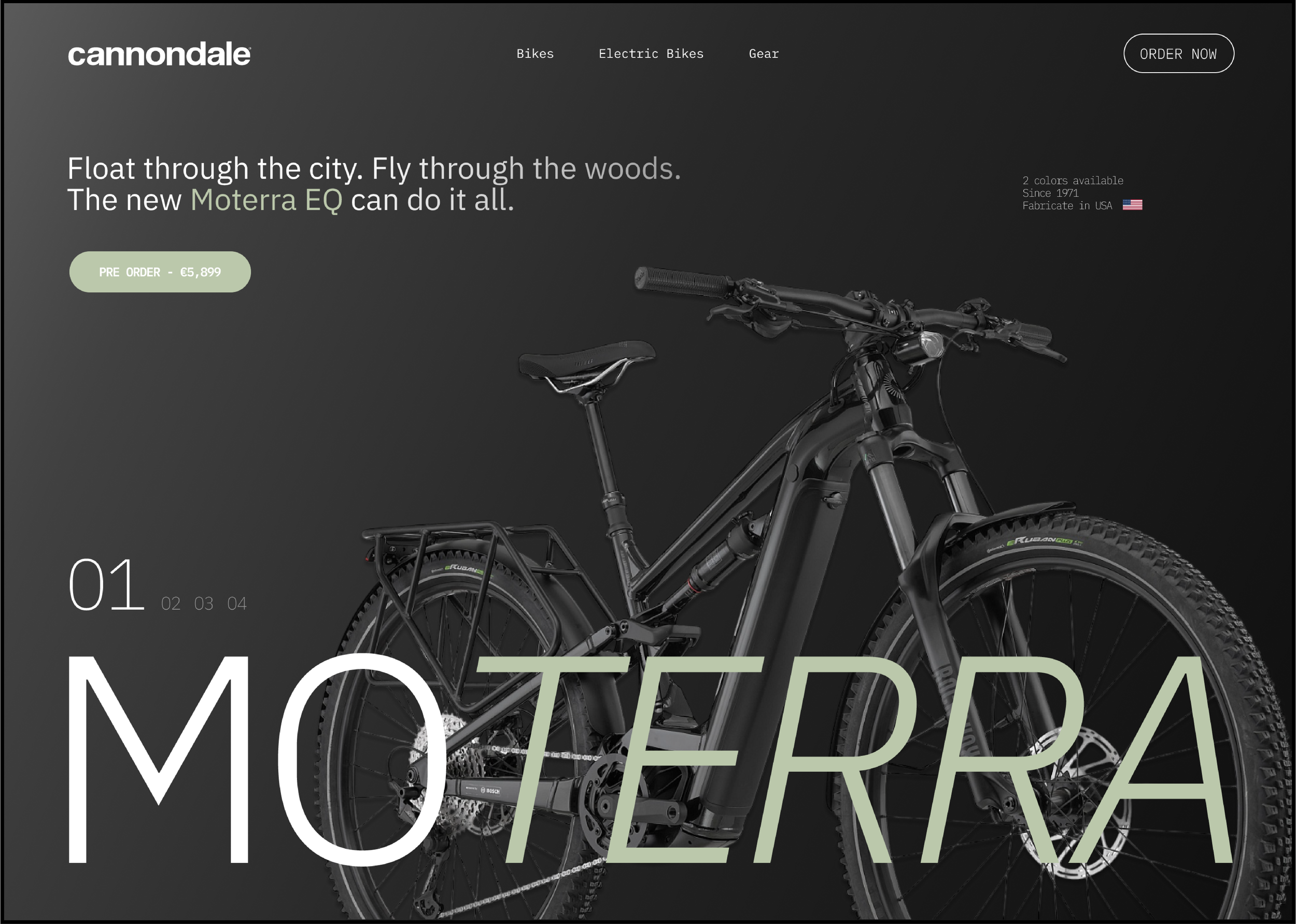
The Cannondale Moterra is one of the most versatile and complete e-bike models on the market, a bike capable of delivering its best performance both in the city and on mountainous terrain.
The exploration of this design aims to give a twist to the landing page on Cannondale's website, seeking to provide greater visibility to the product by drawing attention and adding more value to it. A high-ticket product that combines top-tier performance with technological design.
Wireframe_&_Architecture
In the architecture of the page, several aspects have been considered. The customer must always perceive that we are presenting a product of high technological value, with a variety of components they need to understand in order to realize that this product is not just a vehicle, it is a piece of engineering that will meet all the standards required for a product of this caliber at an excellent level.
The design composition takes the customer on a journey of discovery through the different components, aiming to showcase all the product's strengths. All while ensuring that we highlight an e-bike with a bold and striking design.


Designe_System
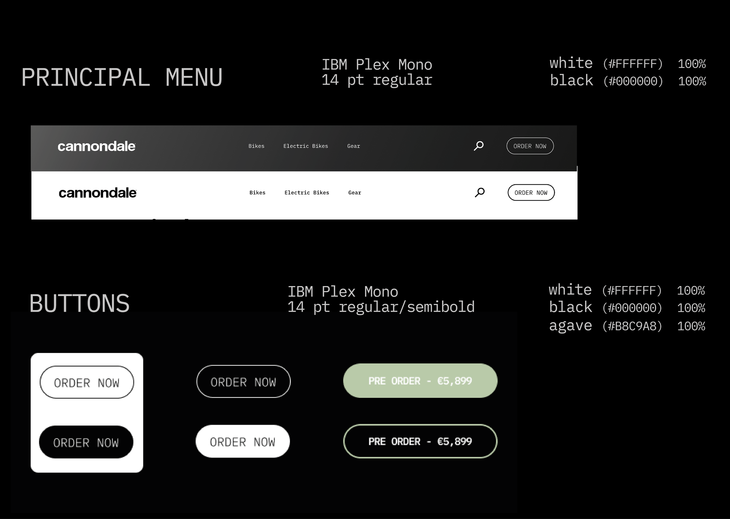
The chosen fonts aim to reflect a minimalist atmosphere with a technological essence. They create a spacious environment that clearly conveys that we are dealing with a bicycle where cutting-edge technology is highly present. The potential e-bike customer is usually someone passionate about technology and well-versed in the meaning of good design.
The monochromatic color palette, with touches of Agave, aims to create a clean space that simultaneously immerses us in the world of Cannondale with its signature Agave green. The two color options for this model are presented within the color palette of the entire landing page.
The main menu accompanies the user throughout their journey, ensuring they can always navigate the website quickly and intuitively. The menu adapts its color to the different background changes while scrolling, always maintaining optimal visibility.
It is a simple and spacious menu that does not obstruct the user’s view or disrupt the atmosphere created by the design.
The composition and design of the buttons, just like the main menu, aim to seamlessly integrate into the design according to the scroll or background color. They subtly yet clearly call the user to action, with colors that blend into the design both in their static state and in hover action.


Designe_Components
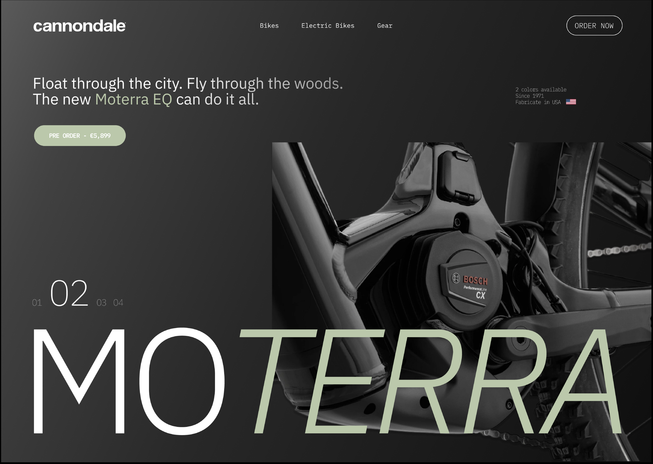
The photo composition aims to showcase not only the different components of the Moterra but also the versatility of this e-bike model. It highlights that this is an all-terrain bicycle, delivering top performance both in urban environments and on mountainous terrain. The potential user is an adventurous, modern, and versatile person, which is why the design seeks to capture their attention by adapting to this behavior throughout the different scrolling phases.

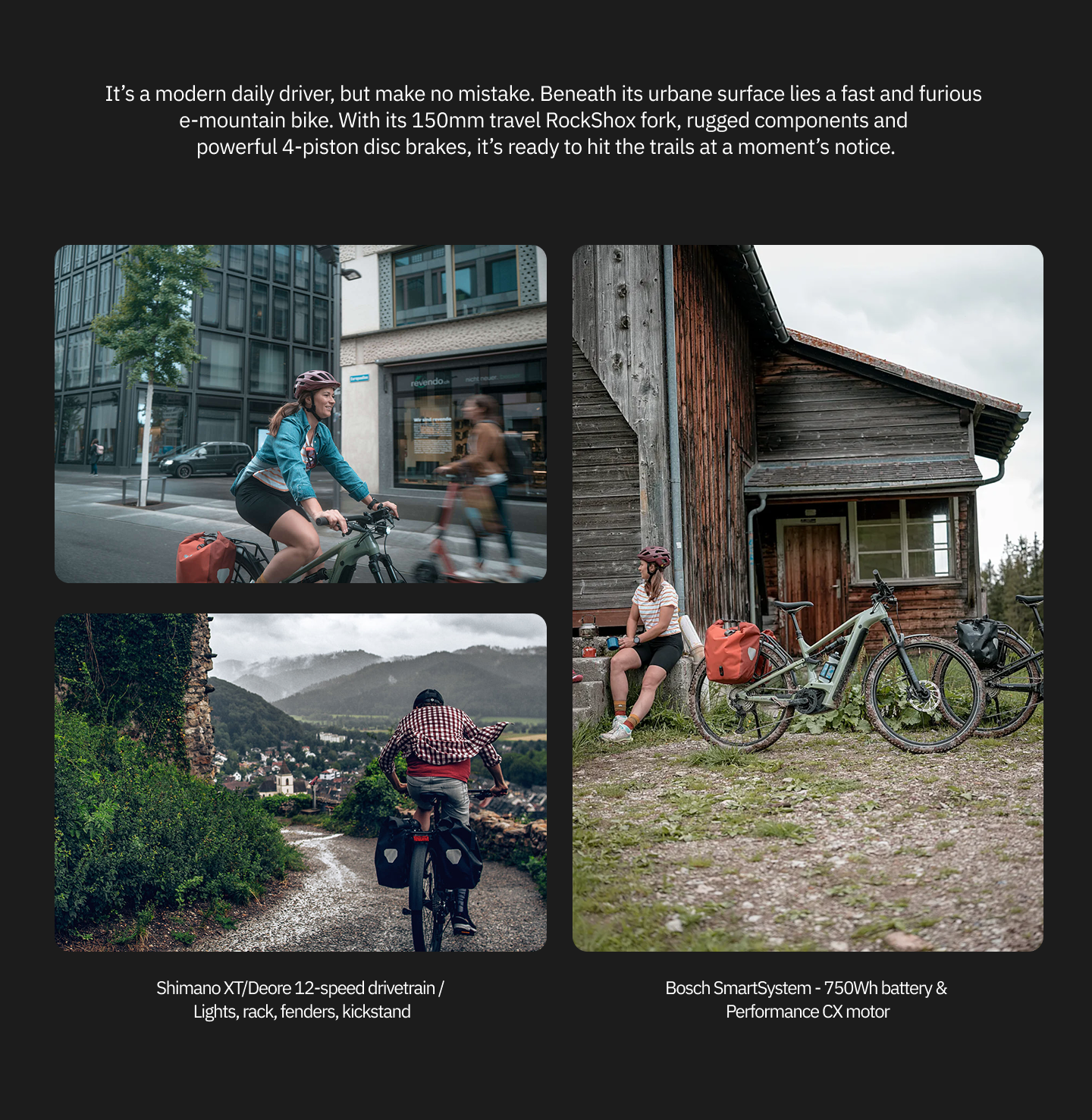

The design aims to be versatile and break monotony as the user scrolls. It blends photo carousels that bring the design to life while always striving to inform and showcase the product's potential.
As a final banner, we want to highlight user reviews, as they help reinforce a potential customer’s decision. Additionally, they also strengthen Cannondale’s confidence in the quality of its products, showing no fear in displaying the opinions of users who have already trusted the brand and the product.
To conclude, a simple banner design that encourages action before reaching the end of the scroll, featuring a button that directs users to the page where they can customize their order and complete the purchase.


